
Brand guidelines
Direction F, “Gilded Meridian”. Swatches and specimens are live. ☾ in the header switches to Vernissage. Reduce Motion resolves to full motion for you.
01
Color
The wall
A single warm-neutral ramp. The art supplies every other color.
the ground
fill · 1.00:1 on ground
raised surfaces
fill · 1.05:1 on ground
chips, recessed fills
fill · 1.08:1 on ground
the ground a work sits on
fill · 1.12:1 on ground
foreground; also sets money
sets text · 16.51:1 · passes 4.5:1
secondary text, never a price
sets text · 6.25:1 · passes 4.5:1
the 1px hairline separator
fill · 1.23:1 on ground
control boundaries · firms to #898982 / #666E79 under prefers-contrast: more
fill · 1.37:1 on ground
errors only, always with text
sets text · 7.12:1 · passes 4.5:1
The chrome thread
Gold appears only on chrome: hairlines, the vouched seal, active indicators, the work-size knob, one CTA per surface. Never on a work. Never on money.
fills and hairlines
fill · 2.13:1 on ground
hover and border
fill · 2.31:1 on ground
the only gold that may set type on light
sets text · 4.64:1 · passes 4.5:1
the highlight at the center of the gilt ramp
fill · 1.39:1 on ground
The global layer
Blue appears only on global facts: city, gallery space, exhibited, meridian graphics. Every blue string is a record field that resolves to a real place.
graphics on ink; the meridian globe
fill · 2.22:1 on ground
city facts as text
sets text · 5.42:1 · passes 4.5:1
Semantic roles
The palette handed to the shadcn role names this app is built on. Two roles deviate from the table below, because it was written against a component set with no menus or sidebar: accent and muted are surface roles here and take --sunken. Use text-muted-foreground for secondary text, and text-blue-text for a record field.
| role | token | note |
|---|---|---|
| background | --bg | |
| foreground | --ink | |
| card | --panel | |
| card-foreground | none | cards inherit --ink |
| popover | none | no popover surface; the sheet is a native <dialog> |
| popover-foreground | none | |
| primary | --gold | |
| primary-foreground | --gold-contrast | |
| secondary | none | secondary buttons are a border, not a fill |
| secondary-foreground | none | |
| muted | --sunken | |
| muted-foreground | --muted | |
| accent | --blue | |
| accent-foreground | none | blue never becomes a fill behind text |
| destructive | --destructive | |
| destructive-foreground | none | errors are text on the ground |
| border | --line | |
| input | --input | |
| ring | --ring |
02
Gold
Gold is a five-stop ramp, not a flat fill: shadow, body, highlight, body, shadow. Interpolated in oklch so the sweep stays chromatic.
0%
28%
50%
72%
100%
On ink the whole ramp lifts to the bright end. The meridian globe restates the same five stops as an SVG gradient.
.gilt
the 3px top edge, the active-tab underline, the one gold CTA
.gilt-soft
half strength; hairlines that mustn’t out-shout a work
.gilt-edge
a gradient border: border-color takes no gradient, so the ground paints the padding box and the ramp the border box
The gold budget for a surface is one gilt hairline, one CTA, and seals. No gold area larger than a button, no gold text below 12px, nothing gold within reach of a work.
03
The aurora
Marketing surfaces only. Product chrome never carries it.
specimen · marketing only · drift ≤ 12s per loop
The recipe
The ink ground plus three washes, placed apart so they barely overlap.
- #CFAA32 · 0.34 peak · low-left
- #52B5E0 · 0.3 peak · high-right
- #FED159 · 0.1 peak · upper-center
As a shader
The ground sits between the two accent lobes: a mesh interpolates between adjacent stops, and gold to blue in sRGB passes through olive green.
The aurora is a marketing surface only. It never appears within sight of a work, and it holds still under Reduce Motion. The meridian globe never animates, and appears at most once per page.
04
Typography
Instrument Serif (Display)
Bunny Fonts (OFL), self-hosted · regular + italic · no tabular numeralsEvery art capital
Display headers, hero lines, and work titles in italic, the way a wall label sets a title. Never body, buttons, navigation labels, or facts.
Archivo (The voice)
Bunny Fonts (OFL), self-hosted · 400 · 500 · 600 · tabular numeralsEvery art capital
UI, body, artist names, buttons. Never sets a fact.
Spline Sans Mono (The evidence)
Bunny Fonts (OFL), self-hosted · 400 · 500 · tabular numerals$14,200 · 73 × 93.4 cm
Every fact and every price: dimensions, edition, dates, tags, record IDs, filter values. Tabular throughout. Zero mixing of families within one string.
Only these weights are loaded, self-hosted through the Vite font pipeline. Any other weight synthesizes.
The ramp
Every art capital, one gallery
the hero headline, and nothing else
Every art capital, one gallery
page display headers; a work title on its detail page
Every art capital, one gallery
serif section headings, one per Gallery Space
Every art capital, one gallery
work title on a wide-column card; the sans page h1 at 500
Every art capital, one gallery
work title on a narrow-column card, the wordmark, the viewing-room title
Every art capital, one gallery
ledes and sheet headings
Every art capital, one gallery
artist attribution, body copy
Every art capital, one gallery
artist attribution on a narrow-column card
Every art capital, one gallery
the dominant UI size; the primary mono fact line; form controls
Every art capital, one gallery
secondary facts, chips, seals, mono eyebrows; the smallest type in the system
Sizes are in rem, so type answers a reader’s font-size preference. Tracking is 0 on every step.
The wall label
Exactly four lines, in a fixed reading order, each on its own step.
Wheat Field with Cypresses
Vincent van Gogh, 1889
$14,200 · available · unique original
oil on canvas · 73 × 93.4 cm · New York
- 1 · title: serif italic, worktitle
- 2 · artist + year: Archivo, body, muted
- 3 · fact line: mono, label, ink
- 4 · materials, dimensions, city: mono, caption, muted + blue
Tabular by default
font-variant-numeric: tabular-nums is set on the root, so every price and dimension aligns. Money right-aligns in any column of two or more.
| New York | $14,200 |
| Madrid | $8,600 |
| Seoul | $122,000 |
| Dubai | $940 |
05
Form
Radius, measure, target and elevation.
Radius
2px
a work’s frame; capped here so the frame never becomes the subject
0.375rem
chips, seals, the record badge
0.5rem
controls, buttons, form fields
0.625rem
structured surfaces
0.75rem
the bottom sheet
9999px
compact chips, the hero CTA, icon controls; never a default container
Measures and targets
| 1240px | every page shell | |
| 580px | the hero lede | |
| 52ch | the prose measure | |
| 420px | the bottom sheet | |
| 2.75rem | 44px, the minimum for anything interactive |
the floor
below it
Spacing
4px base · Tailwind’s default scale, used unchanged
- Column gaps ≥ 40px at wide, stack gaps ≥ 32px at narrow; two adjacent works never share an edge
- Vertical rhythm in the salon hang comes from a fixed 48px stack gap only
- Header and filter chrome together ≤ 96px tall at rest
- On Browse at 1440px, artwork occupies ≥ 55% of first-viewport pixels
Elevation
shadow-hung
The only shadow in the system. Nothing else carries one at rest except modal sheets and floating media controls.
06
Motion
Nothing moves position. Opacity is the only animated property on public surfaces: things appear and recede like gallery lighting.
| what moves | property | duration | easing | reduce motion |
|---|---|---|---|---|
| Media controls reveal / recede | opacity 0→1 | 120ms | ease-out | instant show / hide |
| View change (grid→detail, zoom→room) | opacity crossfade | 160ms | ease-in-out | hard cut |
| Deep zoom scale change also suppressed mid-gesture, so it never lags the finger | transform scale | 180ms | ease-out | steps to target zoom |
| Skeleton· not implemented nothing in the build waits long enough to need one | opacity 0.55 ↔ 0.8 | 1.8s loop | ease-in-out | static at 0.7 |
| Card hover hover changes nothing but cursor and focus ring | none: no lift, no scale | none | none | none |
| Hero aurora drift marketing surfaces only; the meridian globe never animates | shader time | ≤ 12s per loop | linear | held static |
| Hero reveal past the 200ms product ceiling, which is why it is fenced to marketing | opacity + y + blur | 700ms · 850ms headline | cubic-bezier(0.22, 1, 0.36, 1) | a cut: the reveal does not slow down, it stops existing |
Under Reduce Motion the reveal does not slow down, it stops existing. Currently full motion for you.
07
Components
Rendered from the components the product uses, not screenshotted.
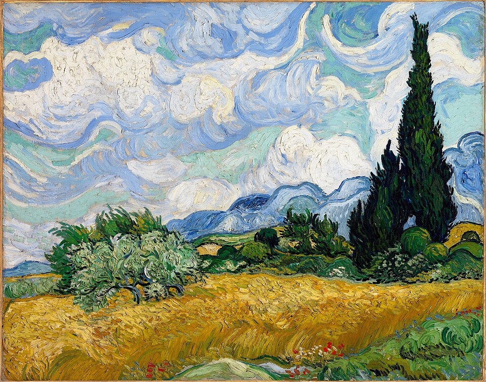
Work, complete
radius 2px, object-contain, nothing overlaid
Verdict row
always buttons, ≥44px; state carries a mark and a weight, not a hue
Vouched seal
gilt-edge chip, mono caption
Record chip
mono on sunken
Form control
min-h-touch, a persistent label, a mono value
Meridian globe
meridians gold, parallels blue; at most once per page. Shown on ink, where it always sits.
The mark
the gilded A; beside it the name sets in the serif, never a brochure wordmark
one gallery, every meridian
Ink island
an additive glow; only works on ink
08
Do and don’t
Both sides are labeled in words, so the distinction survives grayscale.
Gold near a work
✓ do
The work sits on the neutral well, unframed. Gold stays in the chrome.
✗ don’t
A gilt frame makes the brand the subject and recolors the edge of the painting.
What sets money
✓ do
$14,200
Price is ink in the mono face. Money never carries an accent.
✗ don’t
$14,200
Gold on a price makes the number promotional, and reads as a discount.
How blue is used
✓ do
location New York · Gallery Space 12
A city is a record field: a word, in the blue pair, that resolves to a real space.
✗ don’t
Blue as decoration, a swatch carrying no fact, spends the global layer on nothing.
Where the serif goes
✓ do
Wheat Field with Cypresses
73 × 93.4 cm
The serif sets the title. The fact beneath it is mono, with no mixing inside one string.
✗ don’t
Wheat Field with Cypresses
73 × 93.4 cm
A serif fact reads as editorial voice, and facts are evidence, not voice.
How a work is rendered
✓ do
Complete, at true proportion, on the well, whatever its aspect ratio.
✗ don’t
A fixed aspect container crops the work to fit the grid.
Never color alone
✓ do
saved · available
State carries a mark, a word and a weight, so it survives grayscale and color blindness.
✗ don’t
A bare dot encodes availability in hue only, which no one can read reliably.
09
The checklist
Pass/fail criteria. Hold a finished screen against these: failing one line means the screen is not at the bar.
Color
- Exactly two accent hues. Gold appears only on chrome: hairlines ≤ 3px, the vouched seal, active indicators, the work-size knob, and at most one gold CTA per surface.
- Blue appears only on global facts: cities, network entities, meridian graphics. Neither hue ever tints, frames, or overlays artwork.
- Gold budget per surface: one gilt hairline, one CTA, seals. No gold area larger than a button, and no gold text below 12px.
- Money is never gold. Prices set in ink, in the mono face.
- On light grounds gold text is always #8A6E1F; on dark, #FED159.
- No hue outside the neutral ramp and these two accents, except destructive on an actual error, always with text.
Type
- The serif sets display headers, hero lines, and work titles in italic: never body, buttons, navigation labels, or facts.
- Every fact is Spline Sans Mono; every voice string is Archivo. Zero mixing of families within one string.
- Mono never below 12px. Muted mono is for secondary facts only, never a price.
- Every money string uses tabular figures and right-aligns in any column of two or more.
The work
- Works render complete, never cropped, tinted, or distorted. Frame radius ≤ 2px.
- No badge, record, or overlay ever sits on the image area. Near-white works get the 1px hairline.
- Salon columns preserve true proportion: no forced row heights, no aspect-ratio containers that letterbox.
- Browse cards carry exactly four label lines: title, artist + year, fact line, materials and dimensions.
Layout
- Column gaps ≥ 40px wide, stack gaps ≥ 32px narrow; two adjacent works never share an edge.
- Header and filter chrome together ≤ 96px tall at rest.
- Columns reflow 3 → 2 → 1 with label type stepping up in proportion.
- Zero box-shadows at rest, except modal sheets, floating media controls, and a work on the room-view wall.
Interaction
- Touch targets ≥ 44px. Every journey completes with taps alone, with no hover-dependent control.
- Hover changes nothing but cursor, focus ring, and the documented card-action opacity reveal.
- Focus indicators are always visible and never obscured.
- A swipe never votes; verdicts are buttons, never swipe targets.
- Fact lines wrap at em-dashes and never truncate silently.
- No unread badges, streaks, countdowns, or engagement mechanics.
Accessibility
- All text pairs ≥ 4.5:1, measured rather than assumed.
- Meaning is never carried by color alone: availability, state and errors all carry text or a mark.
- At 320px and 200% zoom: no clipped controls, no horizontal text scroll, no lost values.
- Reduce Motion collapses everything to cuts. Nothing autoplays.
10
Accessibility
Text and control pairings, measured against the current ground.
| pairing | measured | needs | verdict |
|---|---|---|---|
| foreground on ground | 16.5:1 | ≥ 4.5:1 | passes |
| muted on ground | 6.2:1 | ≥ 4.5:1 | passes |
| gold text on ground | 4.6:1 | ≥ 4.5:1 | passes |
| blue text on ground | 5.4:1 | ≥ 4.5:1 | passes |
| ink on gold | 7.8:1 | ≥ 4.5:1 | passes |
| focus ring on ground | 16.5:1 | ≥ 3:1 | passes |
| control boundary on ground | 1.4:1 | ≥ 3:1 | below |
| control boundary · prefers-contrast: more | 3.4:1 | ≥ 3:1 | passes |
The control boundary at rest is the one pairing below its threshold, and it is deliberate: a heavier outline on every field is the chrome this direction spends its restraint avoiding. Persistent labels and the focus ring carry the affordance instead, and it stays a recorded, accepted deviation. Anyone whose system asks for prefers-contrast: more gets the row beneath it, which clears 3:1 on every ground a field sits on. npm run contrast asserts that row and prints the other.